Fun with Pseudocolor, Part Two

A more perceptually-uniform, if less pretty, pseudocolor scheme.
A more perceptually-uniform, though arguably less pretty, pseudocolor scheme.

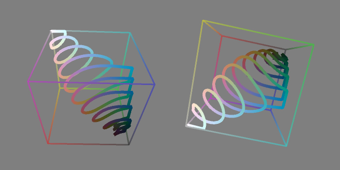
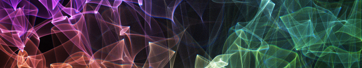
Inspired by this brilliant interactive demo of the perceptually uniform CIE L*a*b* color space, I decided to try a L*a*b* version of my pseudocolor scheme. I don’t find this version as pretty to look at, but it has the advantage that higher values are always mapped to colors that are perceptually brighter than lower values. In other words, if you squint at the image above, the bright and dark regions correspond pretty much exactly to what you’d see if it were greyscale. (For the L*a*b* to RGB conversion, I grabbed pseudocode from this handy page.)

L*a*b* space is much bigger than RGB space, so the spiral gets clipped against the edge of the cube in some places.
L*a*b* space is much bigger than RGB space, so the spiral gets clipped by the sides of the cube in a few places.
If you crank up the saturation, you do get more vivid colors, at the cost of a lot more clipping.