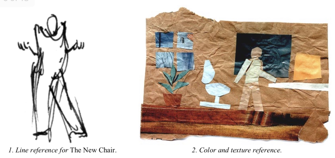
Way back in 1999, I had the pleasure of contributing a segment to a SIGGRAPH course on non-photorealistic rendering. By that point I had made a whopping two-and-a-half animated short films with different visual styles (Brick-a-Brac, Fishing, and a never-finished The New Chair) which in those innocent times made me an authority on the subject. So I threw together a loose framework based on what I’d learned from those experiences, and built my piece of the course around that.
I went back and re-read it the other day, and was surprised to find a lot of it still holds true. In particular, one lesson that we carried through in both Pearl and Age of Sail is that if you plan ahead and you’re smart about it, committing to a stylized look can also save you a lot of time and money.
So if you’re interested in making a film with a new visual style, but you just don’t know where to start, have a look!

