Category Archives: graffiti

Graffiti Archaeology is back!

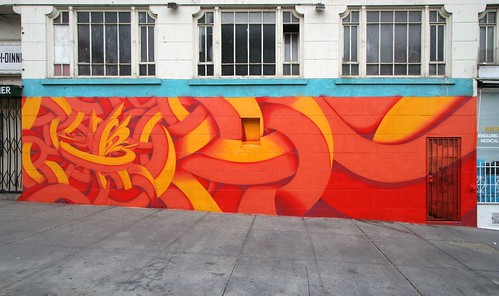
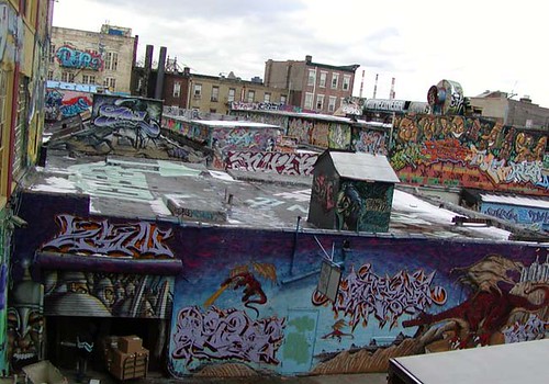
This just in: Graffiti Archaeology is officially back up and running!

Graffiti Archaeology running on an iPhone!

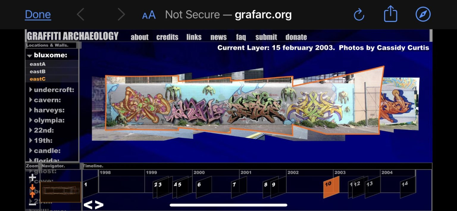
The web app had been languishing for years, as more and more developers stopped supporting the Flash player it depended on: first Apple refused to allow it to run on iOS, and then Google’s Chrome browser stopped allowing it, and finally in 2020 Adobe retired the format entirely. But then last year, I learned about Ruffle.rs, a shiny new Flash player emulator developed in Rust. I tried it out, but it had some missing features that broke our user interface. So I filed a bug report, but I didn’t have great expectations that it’d get fixed anytime soon. After all, it’s an open source project run by volunteers, who I’m sure have much more important things to do than fixing bugs in weird old web art projects.

Well, this weekend, one of Ruffle’s amazing and generous developers went ahead and added the missing feature. And just like that, our app is up and running again! Not only that, but it runs in places it has never run before, like iPhones and other iOS devices!

The experience on iOS isn’t perfect, mainly because we developed the UI for desktop computers with keyboards and mice, not touchscreens and thumbs (remember, this was about five years before the first iPhone came out!) Some features, like the tooltips that appear when you hover over a button, will never work on a touchscreen, because there’s no such thing as hovering without clicking. Other things just feel clunky, like the fact that you can’t pinch to zoom (another now-ubiquitous UX metaphor that hadn’t yet been popularized.) But even with those limitations, seeing our twenty-year-old project running on modern hardware is a total thrill.

I’m incredibly grateful to the Ruffle developers for making this possible. The world may be a mess, but communities like this are a good reminder that sometimes, if we work together, we can have nice things.

Interview in LAB 04

LAB magazine issue 4After a long hiatus, Joseph Robertson’s excellent LAB magazine is back, and it features an interesting three-way interview he conducted with me and graphic designer Ian Lynam (author/editor of Parallel Strokes) over five years ago. It’s a fun meander through many of my favorite alphabet-related topics. The rest of the magazine is gorgeous and stimulating, as always. You can download the whole thing as a PDF for free, or buy a hard copy via print-on-demand. (I already have two earlier issues, and they’re handsomely bound and printed, well worth the cover price.) Or, just go straight to our interview. Enjoy!

(Previously: Folk Typography essay in LAB 01)


Asemic Writing and Speech

Asemic MagazineAsemic is a magazine of asemic writing, or writing without semantic content. It’s full of fun peripheral glyphery, little black-and-white shadows of nonsense coming out of the fog. The individual pieces are hit or miss, but the variety is wonderful.

I never knew there was a word for it, but asemic writing is something I’ve loved for years. The fact is, I love the form of language more than its content. It’s why I like foreign accents, and listening to languages I don’t understand. It’s why I spent so much time in college listening to Cocteau Twins. It’s one of the main reasons I love graffiti. My first Burning Man project was an exercise in asemic writing and speech.

I started speaking in tongues on the subway in New York in high school. Acting like a crazy person is an effective strategy for dealing with certain tricky situations. And it was fun to watch people try to guess where I was from. But over time, it became something I would do for my own enjoyment, even when nobody else was around. It was just a joy to be able to speak without having to mean anything. All the beauty of form without the burden of content. It was comforting, like a dog’s chin resting warmly on your knee, not saying anything in particular, just existing.


an almost completely asemic piece by San Francisco writer APEX.

I’ve also noticed a trend towards asemic writing among some of my favorite graffiti writers. While most start their artistic lives with the written word, there’s always an abstract component, and there comes a point in certain writers’ development where the abstraction takes over completely. Maybe they feel the same attraction to meaninglessness that I do.


Related links:
Asemic calligraphy by Emma Viguier.
Book from the Sky (asemic Chinese by Xu Bing).
various works by Brion Gysin.
Diploma by Saul Steinberg
PCOET by David Melnick
Tender Buttons by Gertrude Stein

(originally via MetaFilter)

Neither Graffiti Nor Animation

robinrhode-he-got-game-2000.jpg

Tonight I learned that one of my favorite graffiti spots, London’s “Undercroft” skatepark, has temporarily been taken over–or rather been given over by the authorities–to an artist named Robin Rhode. If you search Google or YouTube you can see some of the guy’s work… some of it is actually kinda interesting, but nowhere near cool enough to justify shutting down the Undercroft for a whole week, in my opinion.

His schtick seems to be taking a series of photos where he draws some stuff in chalk on the wall or floor, and then photographs himself a bunch of times miming some kind of simple action, like waving a flag made of bricks, or slam-dunking a basketball into an imaginary basket. He shows the work as a series of photos in a gallery, or a videotaped slide show of same.

The London-based graffiti writers in my Flickr circles have been putting him down because he’s an “artist” (as opposed to a writer), and in this case, they have a point: everyone else who paints at the Undercroft does so on their own time and resources, and at their own risk. Then, here comes this guy with a team of contractors to do the heavy work of priming the walls for him, so he can stroll in and do his drawings. And Southbank Centre actually shuts down the skatepark for a whole week just to give him room to do his thing. That’s got to bother a lot of people, given the strong anti-authority thread in the subculture: “real” graffiti writers don’t ask permission, and they certainly don’t hire assistants to do their dirty work. Graffiti writers, in a way, created the Undercroft. It’s hard not to feel like this action is taking their baby away from them.

For my part, I get irritated when art critics credit Rhode as doing “stop-frame animation“, when all he’s ever produced is a mere storyboard of an action. What he’s doing is almost animation, but it’s not really, because he never seems to shoot enough photos (nor have a strong enough grasp of the principles of motion) to make it work–it certainly wouldn’t play well at 24 frames per second–so instead he shows it as a series of stills. Pretty weak sauce, especially when there are artists like Blu out there doing full-on hand-painted animation on the street. And so I find myself wanting to hate on the guy, even though we’ve never met.

What’s interesting to me is that what these two responses have in common: both animation and graffiti require a lot of skill, effort, dedication and time. So when someone steps into either territory who doesn’t seem to be willing to put in that effort, it’s going to bother the people who live there.

Anyway, Rhode’s intervention is scheduled to end on October 4th, so it’ll all be over shortly. I look forward to seeing the writers and skaters take back their Undercroft with extreme prejudice.

Calligraphic Packing

elephant_450.jpg

What do you call a pocket full of chisel-tip markers? Calligraphic Packing! It’s also the name of a computer graphics research project from the University of Waterloo. My friend Craig Kaplan, a professor there, is a pioneer of “computational calligraphy”, a brand new research area that’s about to grow in some very interesting directions. Craig’s been interested in graffiti for a long time, for a lot of the same reasons I am. We each have our own ways of studying it, and his way is to take it apart, learn what makes it work, and write software that embodies that understanding. This project, led by Craig’s student Jie Xu, is the first step in what I hope will be a long and fruitful quest, as Craig puts it, “to probe the nature of letterforms and legibility”.