December 31, 2020 marked the official demise of Adobe (nee MacroMedia) Flash. On that day, a number of web-native interactive artworks (Graffiti Archaeology among them) disappeared from public view, seemingly forever. This felt like a classic case of “why we can’t have nice things”, and it made me sad, but of course we all have had much bigger things to worry about the past couple of years, so I tried to just let it go and move on.
Imagine my delight, then, when I learned about Ruffle, a Flash Player emulator written in Rust. I’ve been tinkering with it the past couple of days, and while it isn’t perfect, it’s really quite impressive! Super easy to install, and when it works, it works everywhere, no fuss.
The grafarc UI reveals a number of ways in which Ruffle seems to differ from the original Flash Player, which makes the user experience a lot jankier than we originally intended. (You can install the Ruffle browser extension if you want to see for yourself.) So, I won’t be switching that on by default just yet– I’ll see if I can work with the developers to fix those glitches first.
But I also tried it on my old synaesthesia visualization applet, and there it works perfectly! (On desktop, at least– because the applet requires you to type words on a keyboard, it won’t work on mobile devices just yet.) So I’m happy to report that with one line of code, an old interactive artwork that I believed long gone has returned, unscathed, from the abyss.
Long live Flash! And three cheers to the devs of Ruffle!
For a few weeks last spring I had the tremendous pleasure of working with my dear friend Eric Rodenbeck on an amazing project: an Atlas of Emotions. Commissioned by the Dalai Lama, and based on decades of scientific research by Paul Ekman and his colleagues, the project aims to help people find a path through the complex landscape of their feelings toward a state of calm and happiness.
This was such a fresh and exciting experience. First, because Stamen is an absolutely lovely place to spend time for any reason. (Seriously: pineapple plants and bubble machines!) Second, because it forced a connection between parts of my brain that had never met before: emotion brain, meet design brain. Well, hello! My time on the project was brief and my contribution very small, but will that stop me from kvelling? No it will not! The rest of my feelings can be found right here.
A more perceptually-uniform, though arguably less pretty, pseudocolor scheme.
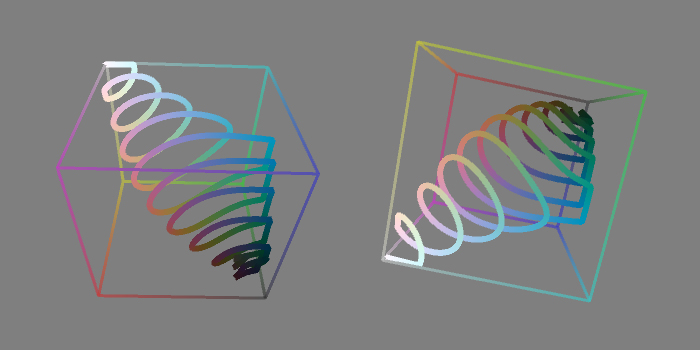
Inspired by this brilliant interactive demo of the perceptually uniform CIE L*a*b* color space, I decided to try a L*a*b* version of my pseudocolor scheme. I don’t find this version as pretty to look at, but it has the advantage that higher values are always mapped to colors that are perceptually brighter than lower values. In other words, if you squint at the image above, the bright and dark regions correspond pretty much exactly to what you’d see if it were greyscale. (For the L*a*b* to RGB conversion, I grabbed pseudocode from this handy page.)
L*a*b* space is much bigger than RGB space, so the spiral gets clipped by the sides of the cube in a few places.
If you crank up the saturation, you do get more vivid colors, at the cost of a lot more clipping.
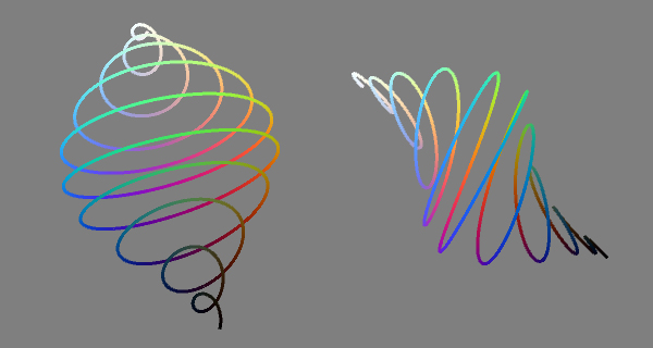
A shader experiment gone horribly, beautifully wrong.
I was tinkering with some GLSL shaders in Processing, and I needed a way to visualize a value that smoothly changes from 0 to 1, showing a lot more than the 256 levels of gray that you’d normally see. So I wrote a little pseudocolor function that spirals through colorspace from black to white, hitting various hues along the way. It’s fun, and pretty, and very rungy-chungy, so I thought I’d post it here.
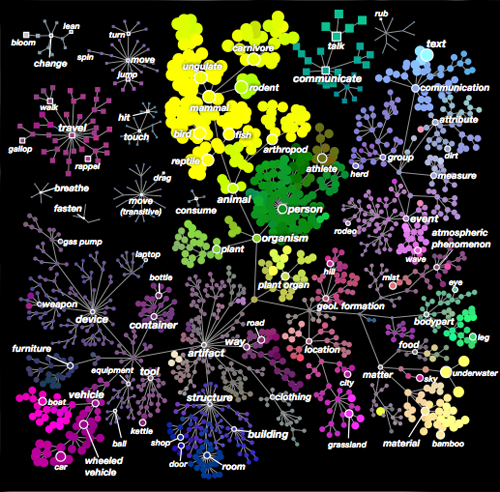
A color-coded map of four dimensions of the semantic space. The branches show “is-a” relationships.
This is one of those moments in science that makes me think I’m so lucky to be alive right now. A team of scientists at UC Berkeley have found a way to map the brain’s representations of objects into a shared semantic space— a multidimensional space in which related things are nearer than unrelated ones. And there’s reason to believe this might be not just a semantic space, but the semantic space: they ran their test on five different people, and found that the first four dimensions of this semantic space were the same for all five subjects–dimensions easily labeled with ideas like moving/stationary, man-made/natural, animate/inanimate, and so on. In other words, the brain’s way of relating different objects might be something we all share at much more than a superficial level. This alone is pretty mind-blowing to me.
As if that weren’t enough, they’ve also created a very cool interactive visualization that shows how all of this plays out on the surface of an actual brain. (That page requires WebGL and a lot of memory, so if you’re reading this on an older device, you might want to just watch the video instead. Actually, you should watch the video anyway, because it’s really well done!)
Evan Shinners is a classical pianist who plays Bach with a style best described as “balls out”. He’s also a synaesthete. In this video, he’s visualized his colored hearing for the rest of us, and the results are stunning! (via Boing Boing.)
If you look closely at my friend Drew Olbrich, you might notice something strange about him. He doesn’t like to talk about it, but: the part of Drew you can see is just an infinitesimal slice of a much higher-dimensional being.
To give the rest of us a sense of what it’s like to be him, Drew’s written a nifty little app (for your iPhone or iPad) called The Fourth Dimension. Give it a spin, and see if it doesn’t thicken your mind up just a little bit.
There’s been some discussion brewing among certain filmmakers about the impact of making movies that play faster than the current standard of 24 frames per second. Peter Jackson is shooting The Hobbit at 48fps, and others are reportedly experimenting with rates like 60 or even 120.
Mixed into the discussion are some really deep misconceptions about how vision and perception actually work. People are saying things like “the human eye perceives at 60fps”. This is simply not true. You can’t quantify the “frame rate” of the human eye, because perception doesn’t work that way. It’s not discrete, it’s continuous. There is, literally, no frame rate that is fast enough to match our experience of reality. All we can do, in frame-by-frame media, is to try to get closer.
The problem is that our eyes, unlike cameras, don’t stay put. They’re active, not passive. They move around in direct response to what they are seeing. If you watch an object moving past you, your eyes will rotate smoothly to match the speed of the thing you’re looking at. If what you’re looking at is real, you will perceive a sharp, clear image of that thing. But if it’s a movie made of a series of discrete frames, you will perceive a stuttering, ghosted mess. This is because, while your eyes move smoothly, each frame of what you’re watching is standing still, leaving a blurry streak across your retina as your eyes move past it, which is then replaced by another blurry streak in a slightly different spot, and so on. This vibrating effect is known as “strobing” or “judder”.
Applying camera-based effects like motion blur only makes the mess look worse. Now, your stuttering ghosted multiple image becomes a stuttering, ghosted blurry multiple image. (The emphasis on motion blur is particularly bad in VFX-heavy action movies, which is why I try to sit near the back.)
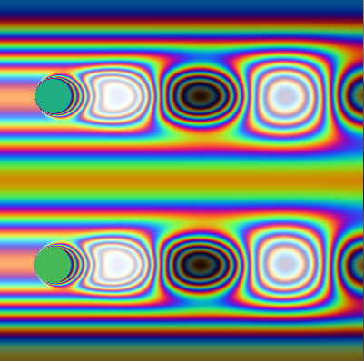
Click the image to see a demonstration of the "judder" effect. This is what your eyes actually see when you watch an object moving back and forth on a movie screen. Even with motion blur, you can see that there's a distracting sawtooth vibration to the ball that can be reduced, but not eliminated, by increasing the frame rate.
Filmmakers tend to work around this problem by using the camera itself as a surrogate for our wandering eye: tracking what’s important so that it effectively stays put (and therefore sharp) in screen space. But you can’t track everything at once, and a movie where nothing ever moves would be very dull indeed.
I am pretty sure there is no frame rate fast enough to completely solve this problem. However, the faster the frame rate, the less blurring and strobing you’ll experience as your eyes track moving objects across the screen. So I am extremely curious to see what Jackson’s Hobbit looks like at 48fps.
There’s a second problem here, which is cultural. My entire generation was raised on high quality feature films at 24 frames, and poorer-quality television (soap operas, local news) at 60 fields per second. As a result, we tend to associate the slower frame rate with quality. Commercial and TV directors caught on to this decades ago, and started shooting at 24fps to try to get the “film look”. How will we perceive a movie that’s shot at 48fps? Will it still feel “cheap” to us? And what about the next generation, raised on video games that play at much higher frame rates? What cultural baggage will they bring into the theater with them?
I’m fascinated by the way our viral video has been spreading around the web. It’s a very chaotic process. One day it’ll get a few hundred views, and the next day 60,000. Blip.tv gives some very basic statistics, but it doesn’t really tell the story of how the clip’s popularity spreads from one community to another. So I’ve started using Processing to try to visualize it. Processing is really easy to learn to use, but certain commands, like bezierVertex(), have slightly less-than-intuitive arguments. The image above was the result of one of several failed attempts to understand that particular function.
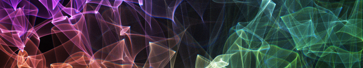
Cassidy Curtis's splendid display of colorful things.