The internets are a wonderful thing. In April 2005, during my Flickr honeymoon, I started a group called Folk Typography: a place to collect all the weird typographical innovations stumbled upon by people whose job is anything but typography. Two years and four hundred photos later, the group’s become a nice little compendium of quirks, and has attracted some remarkable folks.
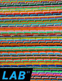
One of those folks is Joseph Robertson, a guy of such astonishing gumption that, in order to teach himself graphic design, he created an entire magazine from scratch: LAB magazine. The first issue was a knockout: beautiful, sleek, and stuffed with more fascinating articles than any ten magazines in my local newsstand. So when Joseph asked me to contribute to an article about Folk Type for the next issue, I couldn’t say no!
That issue is now online for your enjoyment, in its entirety, for free: LAB magazine issue 01. Or you can jump right to the article itself. But if you’re a reader who likes colorful things, I highly recommend getting your hands on a handsomely printed hard copy. Have at it!


