Category Archives: animation

The role of the individual, and: can we stop hating CG now?

Jerry Beck and Amid Amidi at Cartoon Brew are rightly sad about the demise of the big-budget 2D feature. But to me, they seem to be taking it a little too far. It seems like for every bit of news that comes out, they must somehow find a way to use it to denigrate CG animation. When CG films get shut out of the Oscars, it puts a big smile on their faces. Because, you see, CG animation lacks the animator’s individualistic (sic) personality.

Kevan Shorey rightly points out that this just isn’t true. Any halfway-decent animator puts a lot of himself into his shots. When (very occasionally) people tell me they see my body language reflected in the way my characters move, I’m thrilled–nothing could make me happier. And a great animator, well… I can tell a Dan Wagner shot from looking at a single frame, his faces are so memorable and unique!

Everything you make bears the mark of your individual hand. That’s why, even in CG, directors and animation leads still hand-pick certain animators to handle certain shots: they can sense each animator’s affinity for one character, or one kind of acting, over another. What differs between 2D and CG is that in CG, the animator is only responsible for the movement of the character, not the design of the model. But there’s still plenty of room for individuality in the way a character moves.

The question is, is this prized “individualism” really what’s best for the film as a whole? Michael Barrier doesn’t think so. The model of casting-by-shot, he worries, is to blame for the lack of consistency in a character’s performance over a whole film:

…if a half dozen different people animate what is supposed to be the same character, in the same film, then at some level, in some sense, that film is going to contain not six slightly different versions of the same character, but six different characters who look and sound a lot alike. Such variations undermine an audience’s acceptance of the reality of a film’s characters

animated Oscar nominations

Just read the news about the Oscar nominations for Best Animated Feature. I pretty much agree with their choices this time. Wallace and Gromit is the clear favorite, and deserves to win. I loved Howl’s Moving Castle– it wasn’t as amazing as Spirited Away, but that still puts it way ahead of most American animated fare. The only one I disagree with is Corpse Bride, whose story I really hated, though the animation was undeniably good.

I did think it was interesting, if not too surprising, that none of the nominees were CG. These things seem to be cyclical, and it’s only natural that the winds turn in favor of different styles of animation from year to year. It all depends on the story, ultimately. And at least two of the three nominees are clearly the leaders on that count.

But some people seem to be taking way too much delight in what they perceive to be some kind of anti-CG backlash. What’s up with that? How can you hate an entire medium of animation? Do watercolorists have this kind of hatred for oil painters? Not last time I checked. So what’s really going on here?

I guess some people actually blame CG for the death of 2D. I don’t like getting involved in religious feuds, but this is so wrong that I feel obliged to address it. Here’s why it’s wrong. (1) It distracts us from the real villains: short-sighted, small-minded studio execs who can’t think beyond next quarter’s bottom line. (2) 2D animation is not actually dead! Yes lots of people lost their jobs, but believe me, 2D animation is going to come back. This lull is temporary. (3) It’s all about the story, stupid.

I don’t say this as a defender of CG animation against stop motion and 2D. I’m not taking sides. I’m saying that the feud itself is deeply, deeply stupid. I love all forms of animation, each for its own special qualities, and I believe they all have incredible unexplored artistic potential. We shouldn’t elevate one over all others just for nostalgia’s sake, or out of some kind of prejudice. Let’s just work together to make better movies in every medium! Okay?

Animation Mentor!

Animation Mentor


This week I start my first term mentoring students for Animation Mentor. I’ve spent a few days browsing around the site, checking out the work of the students and the critiques of the other mentors, and I am deeply impressed. It’s so well organized, and so much thought has gone into everything, and there’s such a great sense of community among the students and mentors! These guys have really put together something special and new, and I hope it’s a big success for everyone involved.

So, I’m really looking forward to this experience, and I expect to learn as much from the process as the students will. (As a friend of mine put it: a teacher who’s not always learning is not a very good teacher!)

Madagascar DVD comes out today

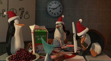
The Madagascar DVD comes out today. Finally, a chance to geek out and frame-by-frame your way through some of that crazy, snappy animation! They also added the Penguins Christmas Caper short that opened for the Wallace and Gromit movie last month. I’m so glad to have been part of these projects. Both the movie and the short were stupendous fun to work on.

Animated News has a sneak preview of some of the features, including a still frame of one of my shots! Check it out:

Criticizing the critics.

This is the first time I’ve worked on a movie that I felt a real emotional attachment to, for better or worse. I loved working on Madagascar, loved the people I worked with, loved the characters, the look, the animation style, and the story premise. The movie speaks to me as a New Yorker and as a warm-blooded mammal. It’s freakin’ hilarious. And the humor is deeper and more character-driven than any of the others I’ve worked on, and I love that.

So I was pretty much completely shocked to see that there are many critics out there who didn’t love this movie like I did. (My friend Melanie felt the same way.) Was I just too close to it? Does the movie have some gigantic deformity that I just couldn’t see? A face that only a mother could love?

The answer is no. After seeing the movie a few times with real audiences, and taking some time to reflect on all the reviews, I’ve come to the conclusion that most of the movie’s worst critics are simply being unfair. Many of them make valid points about problems with the story’s pacing, plot, theme, and so forth. But the conclusions they jump to are completely at odds with everything I know about the experience of enjoying a movie.

Critics of Madagascar seem to fall into three categories: DreamWorks-haters, genre bigots, and the genuinely thoughtful.

The DreamWorks-haters are characterized by the intellectually weak argument that if it ain’t Pixar, it’s crap. These people tend to be more interested in the politics of company A versus company B, and often gloss over the actual films themselves in favor of cheap shots at the corporations that make them. They mistake the messenger for the message. The more sharp-tongued among them can still craft sentences that sting, but the sting wears off once you realize the depth of their ignorance.

The genre bigots are a more subtle bunch. They say things like “The classic shape of a children

Robots!

Blue Sky‘s new movie Robots is quite an artistic accomplishment. Sure, the plot’s a bit predictable and some of the jokes fall flat. But in terms of animation, this movie is stunningly, wonderfully original. My hat is off to directors Chris Wedge and Carlos Saldanha: they have raised the bar with this picture, and we should all take note! These guys set a really tough challenge for themselves, and they consistently lived up to it.

What was the challenge? How to take a ridiculous design like this:

and animate it in a way that’s both believable and appealing. Let’s analyze for a moment just how hard this is. These characters are made of rigid metal parts, so you can’t let the audience see them bending and squishing around, or they’ll start to look like rubber. And yet, if you limit yourself to rigid transformations, you won’t be able to hit those really strong expressive poses that make the character come alive.

What was Blue Sky’s solution to all this? Extremely snappy animation. Hit a pose, stick it, hit another pose, follow through, and so on. If your transitions are fast enough, you can get away with all kinds of non-rigid contortions, as long as you stick to rigid joint movements once you hit that pose. Of course, I’ve only seen the movie once, so I may be misreading it, but I suspect that that was how they made this work so well. Stage magic, folks!

Blue Sky is like the dolphin cousin of the rest of us primates in the animation world. They branched off from our common ancestors lo some twenty years ago (an eternity in CG years), and started doing things their own way. Now they’ve evolved into something sleek and elegant. They make this monkey want to go surfing.