Category Archives: alphabet

Impossible Paint: Asemic Writing

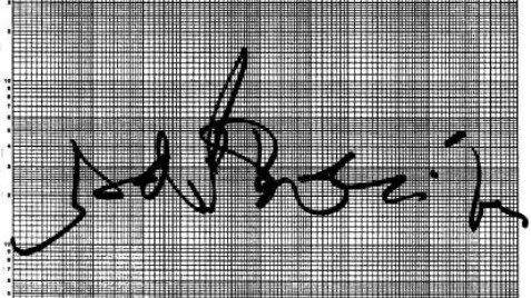
The Genuary prompt for day 14 is “asemic”, i.e. writing without meaning, which is something I’ve always loved. I thought it might be fun to try doing that with my watercolor simulation. Reader, I was not disappointed.

When we rerun the simulation with a different random seed each time, it comes to life in a different way. It turns out the Perlin noise that drives the brush movement isn’t affected by the seed, so “what” it writes stays the same, while “how” it’s written changes. The consistency seems to deepen the illusion of intentionality, which makes me super happy.

This isn’t my first time tinkering with procedurally generated asemic writing. That was in 1996, when I was working at PDI in Sunnyvale. There was a small group of us who were curious about algorithmic art, and we formed a short-lived club (unofficially known as “Pacific Dada Images”) that was much in the spirit of Genuary: we’d set ourselves a challenge, go off to our desks to tinker, and then meet in the screening room to share the results. The video above came from the challenge: “you have one hour to generate one minute of footage, using any of the software in PDI’s toolset”. I generated the curves in PDI’s homegrown script programming language, and rendered them using a command line tool called mp2r (which Drew Olbrich had written for me to use on Brick-a-Brac).

The return of Flash?

December 31, 2020 marked the official demise of Adobe (nee MacroMedia) Flash. On that day, a number of web-native interactive artworks (Graffiti Archaeology among them) disappeared from public view, seemingly forever. This felt like a classic case of “why we can’t have nice things”, and it made me sad, but of course we all have had much bigger things to worry about the past couple of years, so I tried to just let it go and move on.

Imagine my delight, then, when I learned about Ruffle, a Flash Player emulator written in Rust. I’ve been tinkering with it the past couple of days, and while it isn’t perfect, it’s really quite impressive! Super easy to install, and when it works, it works everywhere, no fuss.

The grafarc UI reveals a number of ways in which Ruffle seems to differ from the original Flash Player, which makes the user experience a lot jankier than we originally intended. (You can install the Ruffle browser extension if you want to see for yourself.) So, I won’t be switching that on by default just yet– I’ll see if I can work with the developers to fix those glitches first.

But I also tried it on my old synaesthesia visualization applet, and there it works perfectly! (On desktop, at least– because the applet requires you to type words on a keyboard, it won’t work on mobile devices just yet.) So I’m happy to report that with one line of code, an old interactive artwork that I believed long gone has returned, unscathed, from the abyss.

Long live Flash! And three cheers to the devs of Ruffle!

Interview in LAB 04

LAB magazine issue 4After a long hiatus, Joseph Robertson’s excellent LAB magazine is back, and it features an interesting three-way interview he conducted with me and graphic designer Ian Lynam (author/editor of Parallel Strokes) over five years ago. It’s a fun meander through many of my favorite alphabet-related topics. The rest of the magazine is gorgeous and stimulating, as always. You can download the whole thing as a PDF for free, or buy a hard copy via print-on-demand. (I already have two earlier issues, and they’re handsomely bound and printed, well worth the cover price.) Or, just go straight to our interview. Enjoy!

(Previously: Folk Typography essay in LAB 01)


The Limits of Color Coding

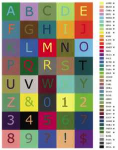
“Ivan is the colour of the letter G but four people saw it as Adam.”

I’m a big fan of color coding. I use it to help me wrap my head around complex tasks, like computer animation. I’m also a pretty harsh judge of color coding schemes, especially for transit systems. Growing up in New York spoiled me for good in that regard: the subway there has its flaws, but color is not one of them. Having synaesthesia also makes me tend to organize names by color in my head (but usually only in my head, since nobody else shares my personal alphabet of colors.)

One of the problems with any color coding scheme is that the more things you need to code, the harder it gets to choose distinct colors. But where exactly is the limit? That’s the subject of this interesting paper, A Colour Alphabet and the Limits of Colour Coding (PDF) by Paul Green-Armytage. The lengths these folks went to to understand the problem are impressive. The paper also has great sentences like “Ivan is the colour of the letter G but four people saw it as Adam.” (Thanks to Mike K. for the link!)

Asemic Writing and Speech

Asemic MagazineAsemic is a magazine of asemic writing, or writing without semantic content. It’s full of fun peripheral glyphery, little black-and-white shadows of nonsense coming out of the fog. The individual pieces are hit or miss, but the variety is wonderful.

I never knew there was a word for it, but asemic writing is something I’ve loved for years. The fact is, I love the form of language more than its content. It’s why I like foreign accents, and listening to languages I don’t understand. It’s why I spent so much time in college listening to Cocteau Twins. It’s one of the main reasons I love graffiti. My first Burning Man project was an exercise in asemic writing and speech.

I started speaking in tongues on the subway in New York in high school. Acting like a crazy person is an effective strategy for dealing with certain tricky situations. And it was fun to watch people try to guess where I was from. But over time, it became something I would do for my own enjoyment, even when nobody else was around. It was just a joy to be able to speak without having to mean anything. All the beauty of form without the burden of content. It was comforting, like a dog’s chin resting warmly on your knee, not saying anything in particular, just existing.


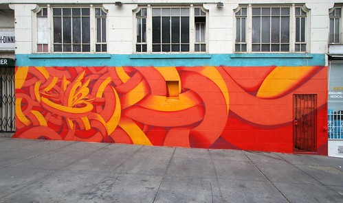
an almost completely asemic piece by San Francisco writer APEX.

I’ve also noticed a trend towards asemic writing among some of my favorite graffiti writers. While most start their artistic lives with the written word, there’s always an abstract component, and there comes a point in certain writers’ development where the abstraction takes over completely. Maybe they feel the same attraction to meaninglessness that I do.


Related links:
Asemic calligraphy by Emma Viguier.
Book from the Sky (asemic Chinese by Xu Bing).
various works by Brion Gysin.
Diploma by Saul Steinberg
PCOET by David Melnick
Tender Buttons by Gertrude Stein

(originally via MetaFilter)

An unusually well-colored alphabet

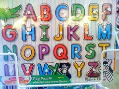
For someone with colored-letter synesthesia, these kids’ toys are usually a frustrating thing to look at, because they generally get my colors completely wrong. So when I see one that gets more than a couple of letters even close to correct, I notice. This one nails the colors of B, P, S and Y, and is well within reason on M, R, and W. Given that orange and pink aren’t in this set’s pool of colors to choose from, even the E and the U are pretty close. Would I buy this set because of that? No, but it did make me stop and take a second look…

Christian Faur’s crayon synesthesia

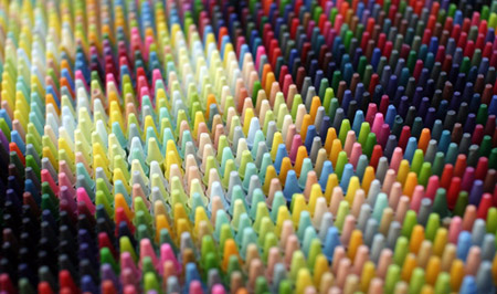
christianfaur_450

Christian Faur is an artist who makes these wonderful image-sculptures out of custom-cast crayons. The work itself is very Rungy Chungy and appealing to the eye. And Faur apparently has a thing for certain mathematicians. But it also turns out that he’s encoded synesthetic messages into several of his pieces:

Further, I have developed a mapping system that translates the English alphabet into twenty six discrete colors and I use these crayon “fonts” to add words and language to each of the pieces in the show… The direct representation of language in each piece further imbues the works with meaning and brings an aspect of color into each composition reminiscent of DNA coding. The alphabetic key at the lower left of each panel allows the viewer to interpret the individual words written throughout the various panels.

I gather that Faur does not actually have synesthesia himself, but this system makes perfect sense to me. If only he’d chosen his colors differently, I might be able to read the text straight up without the key! (Although it’s pleasing to note that his C, E, and Z are all perfect matches for my own.)

(via Drawn)


Calligraphic Packing

elephant_450.jpg

What do you call a pocket full of chisel-tip markers? Calligraphic Packing! It’s also the name of a computer graphics research project from the University of Waterloo. My friend Craig Kaplan, a professor there, is a pioneer of “computational calligraphy”, a brand new research area that’s about to grow in some very interesting directions. Craig’s been interested in graffiti for a long time, for a lot of the same reasons I am. We each have our own ways of studying it, and his way is to take it apart, learn what makes it work, and write software that embodies that understanding. This project, led by Craig’s student Jie Xu, is the first step in what I hope will be a long and fruitful quest, as Craig puts it, “to probe the nature of letterforms and legibility”.