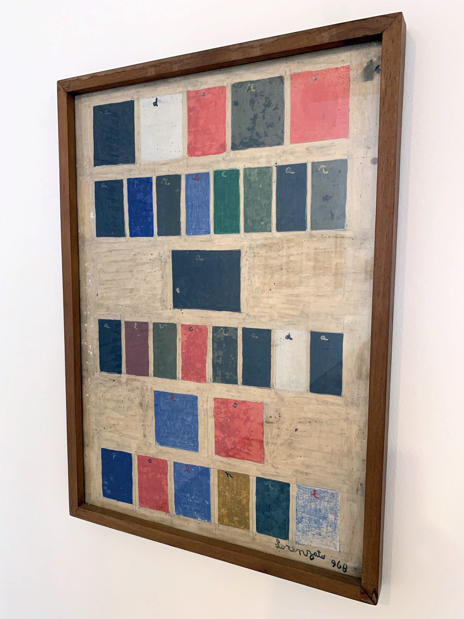
At the Palácio das Artes in Belo Horizonte, we saw an exhibit of the paintings of Amadeo Luciano Lorenzato, a self-taught Brazilian modern artist. Most of the paintings were figurative, or semi-abstract. But tucked in among them was this unique piece: an arrangement of colored rectangles, each labeled with a letter, spelling out the phrase “adoro apreciar a alvorada e o poente” (“I love to enjoy the sunrise and sunset”).
If you know me (or anyone with synaesthesia) a familiar pattern will jump out at you right away: each letter is always represented by the same color. Every O is red, every E royal blue, etc.
Could it be that Lorenzato was a synaesthete, and these are his personal colors?
Digging deeper into the pattern here: each color is specific, not generic: for example, the letter P (which appears twice) is also blue, but it’s a deep navy blue, distinct from the royal blue of E. And the colors are unevenly distributed around the color wheel: there are four distinct shades of green (C, I, V, and T), two blues (E and P), only one each of red (O), yellow (N), brown (L), black (A), gray (R) and white (D), and no examples of orange or purple. This arbitrariness and specificity is typical of the grapheme-color mappings of most synaesthetes.
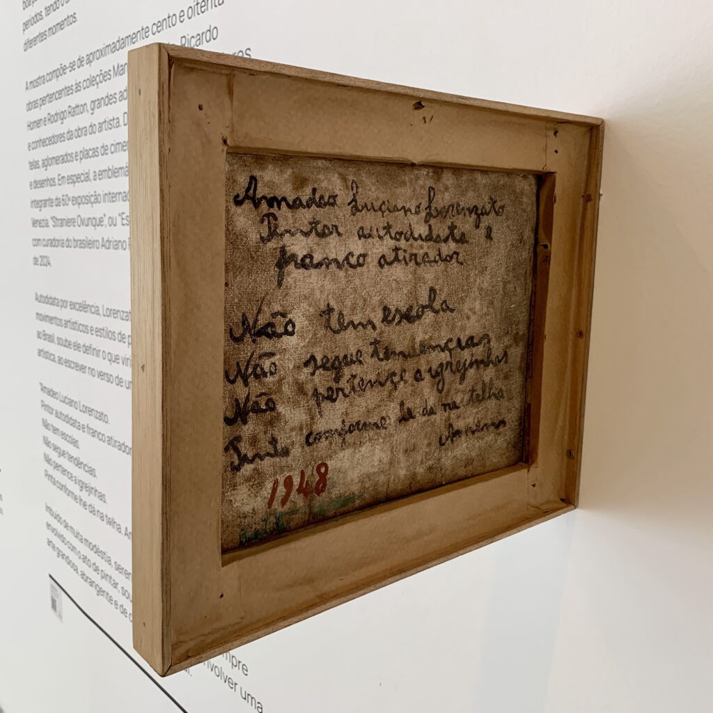
It’s remotely possible he may have been a pseudo-synesthete (someone wrongly believed to have synaesthesia because they used it in their art), but Lorenzato does not seem to have been the kind of artist to follow fashionable trends (see the note on the back of one of his paintings, below.) And a cursory sweep of the grapheme-color mappings of his contemporaries shows no match even slightly better than chance.
So, thus far, all evidence suggests this is a case of true synaesthesia. But since the man himself passed away thirty years ago, we may never know for sure. (If only he’d chosen a more pangrammatical verse for his painting…)