Some refinements on the Chuck Close homage, and then a left turn into something very different. The bugs in my code are a source of unending joy and frustration. Someday, maybe, I’ll fix them, but where’s the fun in that?
Category Archives: art
Big Wet Pixels 6
New today: exploring making each pixel smarter, with more thoughtful brushstroke planning. Starting to get excited about the shapes and textures that emerge. (In case it’s not obvious, I’m reaching for a Chuck Close vibe here. But his work has all kinds of depth to it, I’m barely scratching the surface as of yet.) Also, I’ve added some new types of randomized color palettes, including interference pigments on dark paper. So many happy accidents. I don’t think I’ll ever get bored of this.
Big Wet Pixels 5
Big Wet Pixels 5 from Cassidy Curtis on Vimeo.
Bigger, wetter, more pixelated! Playing with different strategies for sub-pixel brushstroke planning. There are so many possibilities…Big Wet Pixels 4
Big Wet Pixels 4 from Cassidy Curtis on Vimeo.
Continuing to explore grids of big wet pixels. This one could even be considered to fit today’s Genuary prompt, “8×8”, if you squint at it. I’m getting to the point with Unity and C# where it’s starting to feel less like work, and more like play. More to come soon.
Big Wet Pixels 3
Still exploring big wet pixels (originally inspired by the #genuary4 prompt) using my watercolor simulation in Unity. Now the pixels are actually pixels: given a random selection of pigments and paper, they try their best to match the color coming in through my webcam. Lovely glitches ensue.
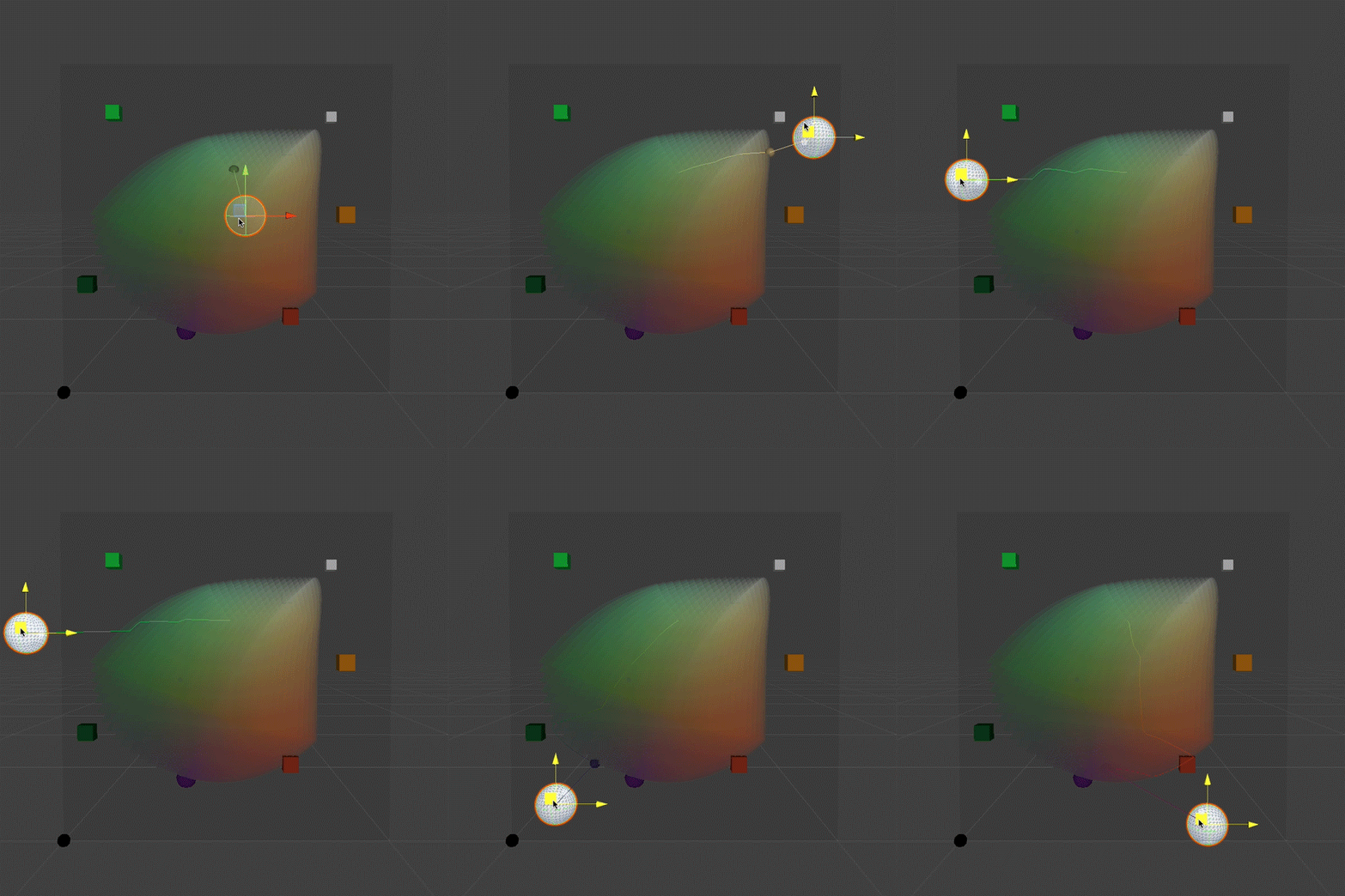
To get this working, I had to go back and solve an old problem that’s bothered me for decades: given an arbitrary set of three pigments and paper, what combination of pigment densities will produce the closest match for any given RGB color? This is non-trivial, because the gamut described by three Kubelka-Munk pigments is non-linear, not necessarily convex, and might even not be an embedding! In our 1997 paper we addressed that problem in a really crude way, which I was never very happy with: quantize the pigment densities into bins, and find the nearest bin in RGB space using a 3d-tree search. So it gave me great satisfaction last weekend when I implemented a continuous solution, using gradient descent.

The curved RGB color gamut described by a trio of semi-opaque white, amber and green pigments on purple paper. The white sphere represents the RGB color we’d like to match. A smaller, colored sphere represents the closest approximation that can be produced within the color gamut. A thin, meandering line shows the path taken from the middle of the gamut via gradient descent.
Genuary 4: More Big Wet Pixels
Getting more aggressive with color and texture…
Genuary 4, 2024: Big Wet Pixels (and No Palettes)
It took me a minute to get going this year, mainly because my watercolor simulation code is a big pile of spaghetti that’s been artfully splattered across the walls and left to dry in place. I’ll have to do a bit of cleaning before I can have more serious fun with it. But I did at least manage to get my synthetic paper layer working, more or less. This video serves the prompts for both #genuary4 (Pixels) and #genuary2 (No Palettes). Happy #genuary to all who observe!
Graffiti Archaeology is back!
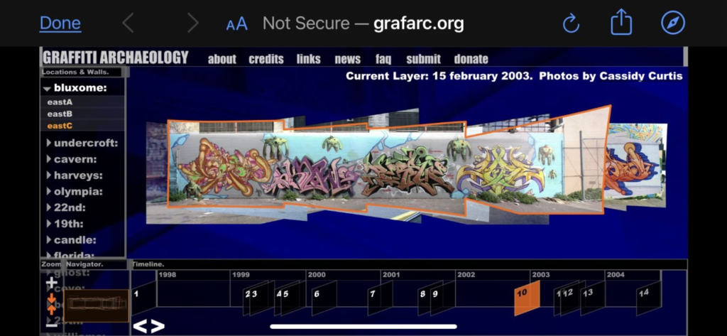
This just in: Graffiti Archaeology is officially back up and running!

The web app had been languishing for years, as more and more developers stopped supporting the Flash player it depended on: first Apple refused to allow it to run on iOS, and then Google’s Chrome browser stopped allowing it, and finally in 2020 Adobe retired the format entirely. But then last year, I learned about Ruffle.rs, a shiny new Flash player emulator developed in Rust. I tried it out, but it had some missing features that broke our user interface. So I filed a bug report, but I didn’t have great expectations that it’d get fixed anytime soon. After all, it’s an open source project run by volunteers, who I’m sure have much more important things to do than fixing bugs in weird old web art projects.
Well, this weekend, one of Ruffle’s amazing and generous developers went ahead and added the missing feature. And just like that, our app is up and running again! Not only that, but it runs in places it has never run before, like iPhones and other iOS devices!
The experience on iOS isn’t perfect, mainly because we developed the UI for desktop computers with keyboards and mice, not touchscreens and thumbs (remember, this was about five years before the first iPhone came out!) Some features, like the tooltips that appear when you hover over a button, will never work on a touchscreen, because there’s no such thing as hovering without clicking. Other things just feel clunky, like the fact that you can’t pinch to zoom (another now-ubiquitous UX metaphor that hadn’t yet been popularized.) But even with those limitations, seeing our twenty-year-old project running on modern hardware is a total thrill.
I’m incredibly grateful to the Ruffle developers for making this possible. The world may be a mess, but communities like this are a good reminder that sometimes, if we work together, we can have nice things.
Homemade ink timelapse
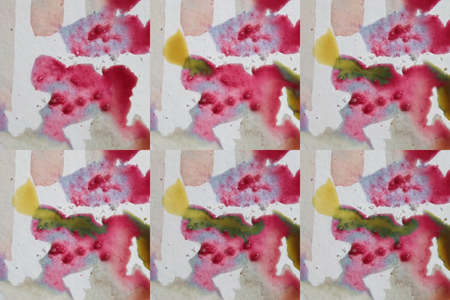
My dear friend Eric Rodenbeck has been experimenting with creating his own homemade inks and paints from natural materials. Some of the inks mysteriously change in texture, and even color, as they dry. After months of looking at Eric’s paintings, I was intensely curious to see how these changes would look as they were happening. So, of course, I had to shoot some timelapse footage.
The inks I used here are hibiscus + lemon (pale red), hibiscus + orange peel (magenta), carrot greens + alum (yellow), and a sprinkling of sea salt for texture. Time span: about 1 hour.
If you pay close attention, something really strange happens about 11 seconds in to the video, when I added some yellow ink: wherever the yellow mixes with the magenta, the mixture turns a deep bluish green! What is going on there?

It turns out that hibiscus gets its color from a type of pigment called an anthocyanin, whose structure and color are pH-sensitive. In an acidic environment, it’s red, but when exposed to an alkaline it turns blue. Since the yellow ink is alkaline, it turns the red hibiscus blue on contact, which then mixes with the ink’s yellow pigment, becoming a lovely vibrant green.
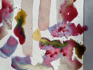
Here are some more photos from the day. Hopefully this will be the first of many such experiments!
Impossible Paint: Asemic Writing
The Genuary prompt for day 14 is “asemic”, i.e. writing without meaning, which is something I’ve always loved. I thought it might be fun to try doing that with my watercolor simulation. Reader, I was not disappointed.
When we rerun the simulation with a different random seed each time, it comes to life in a different way. It turns out the Perlin noise that drives the brush movement isn’t affected by the seed, so “what” it writes stays the same, while “how” it’s written changes. The consistency seems to deepen the illusion of intentionality, which makes me super happy.
This isn’t my first time tinkering with procedurally generated asemic writing. That was in 1996, when I was working at PDI in Sunnyvale. There was a small group of us who were curious about algorithmic art, and we formed a short-lived club (unofficially known as “Pacific Dada Images”) that was much in the spirit of Genuary: we’d set ourselves a challenge, go off to our desks to tinker, and then meet in the screening room to share the results. The video above came from the challenge: “you have one hour to generate one minute of footage, using any of the software in PDI’s toolset”. I generated the curves in PDI’s homegrown script programming language, and rendered them using a command line tool called mp2r (which Drew Olbrich had written for me to use on Brick-a-Brac).

