Okay, one more update for those of you in New York: we will also be doing the first ever live public demo of Patrick Osborne’s Spotlight Story “Pearl” in full 360° at Tribeca’s Interactive Playground on Saturday, April 16th. We’ll be there all day.
Here’s where you can find tickets to the event. Hope to see you there!
Here’s something different: I have a new job! Today was my first day at Google Spotlight Stories. I’ll be working with some amazing filmmakers and technologists who are busy inventing a new kind of narrative visual storytelling uniquely suited to handheld mobile devices. If that sounds crazy, that’s because it is. It’s my kind of crazy. It’s exactly the kind of wild, inventive, “let’s try this and see what happens” attitude that got me interested in computer graphics in the first place, all those years ago. I couldn’t be more excited.
The video above really does a great job of capturing the delight of experiencing one of these stories for the first time. It’s almost impossible not to grin like a ninny. There’s not much more I can say about it right now, but there’s been some terrificpress about the projects they’ve created so far. I’ll share more when I can!
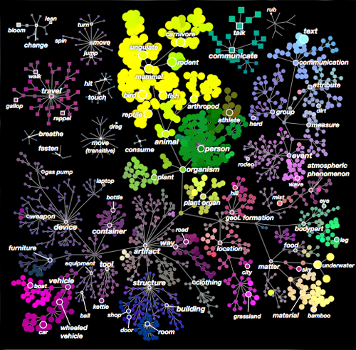
A color-coded map of four dimensions of the semantic space. The branches show “is-a” relationships.
This is one of those moments in science that makes me think I’m so lucky to be alive right now. A team of scientists at UC Berkeley have found a way to map the brain’s representations of objects into a shared semantic space— a multidimensional space in which related things are nearer than unrelated ones. And there’s reason to believe this might be not just a semantic space, but the semantic space: they ran their test on five different people, and found that the first four dimensions of this semantic space were the same for all five subjects–dimensions easily labeled with ideas like moving/stationary, man-made/natural, animate/inanimate, and so on. In other words, the brain’s way of relating different objects might be something we all share at much more than a superficial level. This alone is pretty mind-blowing to me.
As if that weren’t enough, they’ve also created a very cool interactive visualization that shows how all of this plays out on the surface of an actual brain. (That page requires WebGL and a lot of memory, so if you’re reading this on an older device, you might want to just watch the video instead. Actually, you should watch the video anyway, because it’s really well done!)
I’ve been a fan of Ed Stastny’s work since the early days of the web, when SITO.org clued me in to the awesome possibilities of massively collaborative, software-guided web art projects. Gridcosm was surprising, disturbing, inspiring, and highly addictive. It was also a big influence on me personally: without that shining example of the weird things a group of total strangers can do together, I may never have come up with the idea to put Graffiti Archaeology on the web.
Now Ed has a wonderful new project in the works, and he needs your help to make it happen. Yono mashes up 8-bit pixel art, the exquisite corpse surrealist parlor game and Mad Magazine’s fold-ins. It picks up where Gridcosm left off, but it takes full advantage of the magical powers of today’s Internet: it will come with its own pixel art painting tool, and will be designed to work on pretty much any device, so the barriers to participation will be far lower, meaning everyone can play.
He’s offering some very cool thank-you gifts on his Kickstarter, and there are only 9 days left! So if this is something you’d like to support, jump in and help, will you?
My friends at Stamen keep doing wonderful new things to maps. Today’s innovation: a globe’s worth of map tiles rendered automatically in the style of a watercolor painting.
This is the kind of project I could only dream of, back when I was doing this kind of research. So much has happened since then! Stamen’s tiles combine scanned watercolor textures with vector map data from Open Street Maps, and various image-based filters for effects like edge darkening. The results are organic, seamless and beautiful. Even though I know the textures will repeat themselves eventually, I can’t help scrolling out into the ocean, just to see what’s there.
Update: Zach has posted a really nice step-by-step breakdown of how they did this. (Gaussian blurs and Perlin noise are your friends here.) I particularly love the way they use small multiples and animated gifs to explore the parameter space:
Update 2: And now Geraldine has put up her post about painting the watercolor background textures. A process of discovery and exploration, with much trial and error. As a bonus, she’s put up a set of lovely texture samples on Flickr.
If you look closely at my friend Drew Olbrich, you might notice something strange about him. He doesn’t like to talk about it, but: the part of Drew you can see is just an infinitesimal slice of a much higher-dimensional being.
To give the rest of us a sense of what it’s like to be him, Drew’s written a nifty little app (for your iPhone or iPad) called The Fourth Dimension. Give it a spin, and see if it doesn’t thicken your mind up just a little bit.
There’s been some discussion brewing among certain filmmakers about the impact of making movies that play faster than the current standard of 24 frames per second. Peter Jackson is shooting The Hobbit at 48fps, and others are reportedly experimenting with rates like 60 or even 120.
Mixed into the discussion are some really deep misconceptions about how vision and perception actually work. People are saying things like “the human eye perceives at 60fps”. This is simply not true. You can’t quantify the “frame rate” of the human eye, because perception doesn’t work that way. It’s not discrete, it’s continuous. There is, literally, no frame rate that is fast enough to match our experience of reality. All we can do, in frame-by-frame media, is to try to get closer.
The problem is that our eyes, unlike cameras, don’t stay put. They’re active, not passive. They move around in direct response to what they are seeing. If you watch an object moving past you, your eyes will rotate smoothly to match the speed of the thing you’re looking at. If what you’re looking at is real, you will perceive a sharp, clear image of that thing. But if it’s a movie made of a series of discrete frames, you will perceive a stuttering, ghosted mess. This is because, while your eyes move smoothly, each frame of what you’re watching is standing still, leaving a blurry streak across your retina as your eyes move past it, which is then replaced by another blurry streak in a slightly different spot, and so on. This vibrating effect is known as “strobing” or “judder”.
Applying camera-based effects like motion blur only makes the mess look worse. Now, your stuttering ghosted multiple image becomes a stuttering, ghosted blurry multiple image. (The emphasis on motion blur is particularly bad in VFX-heavy action movies, which is why I try to sit near the back.)
Click the image to see a demonstration of the "judder" effect. This is what your eyes actually see when you watch an object moving back and forth on a movie screen. Even with motion blur, you can see that there's a distracting sawtooth vibration to the ball that can be reduced, but not eliminated, by increasing the frame rate.
Filmmakers tend to work around this problem by using the camera itself as a surrogate for our wandering eye: tracking what’s important so that it effectively stays put (and therefore sharp) in screen space. But you can’t track everything at once, and a movie where nothing ever moves would be very dull indeed.
I am pretty sure there is no frame rate fast enough to completely solve this problem. However, the faster the frame rate, the less blurring and strobing you’ll experience as your eyes track moving objects across the screen. So I am extremely curious to see what Jackson’s Hobbit looks like at 48fps.
There’s a second problem here, which is cultural. My entire generation was raised on high quality feature films at 24 frames, and poorer-quality television (soap operas, local news) at 60 fields per second. As a result, we tend to associate the slower frame rate with quality. Commercial and TV directors caught on to this decades ago, and started shooting at 24fps to try to get the “film look”. How will we perceive a movie that’s shot at 48fps? Will it still feel “cheap” to us? And what about the next generation, raised on video games that play at much higher frame rates? What cultural baggage will they bring into the theater with them?
I was home sick from work today, too sick to talk or really get out of bed and do anything– but fortunately not too sick to tap on a keyboard for a while. So I cracked open my long-neglected laptop and downloaded the latest version of Processing, which for those of you who don’t know it, is a really cool programming environment designed for artists. It’s a great big toybox full of fun gadgets, with plenty of examples to crib from, so you can just start with something interactive right away, and tinker with it until it does what you want–or does something completely unexpected.
It’s funny, because I was just talking with a friend the other day about watercolor, and how the happy accidents are what make that medium so much fun. We were comparing it to our day jobs in computer animation, where everything that happens is deliberate (not to mention expensive.) So it’s nice to see that happy accidents can happen in the computer once in a while too.
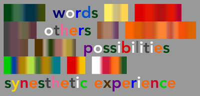
If you’ve spent any time wandering around my rambling home page, you might know that I have colored-letter synesthesia. For years I’ve been looking for ways to convey to other people what the experience is really like. This is not a simple task, because the colors are kind of dynamic: they change depending on a number of factors.
One of those factors is memory, and another one is attention. If I glance at a word once in passing and try to remember it later, chances are I’ll remember only some basic information about it: the length of the word, and the dominant color (which is usually, but not always, determined by the first letter.) Remembering the whole word will mean trying to remember the specific colors of all the letters, which then, sometimes, allows me to remember the letters themselves.
To help illustrate what this feels like, I built a little Flash applet. As you type words into it, they appear with each letter in its proper color. But as time passes and memory fades, the letters are replaced by blocks of color that approximate what little I might remember. To refresh your memory, you can pay attention to the words by moving your mouse towards them.
I actually wrote this almost two years ago, but somehow forgot to put it up online. (Another case of memory fading as time passes.) I think I had some notion about making it better, or adding punctuation or something. But a random email reminded me of it, and I realized nobody cares about punctuation these days anyway. So here it is. Enjoy!
Cassidy Curtis's splendid display of colorful things.