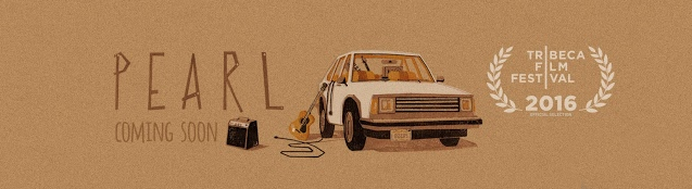
Banana Frog, June 2: The Making of Google Spotlight Stories’ Short Film: Pearl
Nerd Reactor, June 2: Patrick Osborne on ‘Pearl’ VR-animated short and life after Disney
Cartoon Brew, June 1: Nine Can’t-Miss Events at Annecy 2016
iAnimate Podcast, May 31: Interview with Animator & Director Patrick Osborne
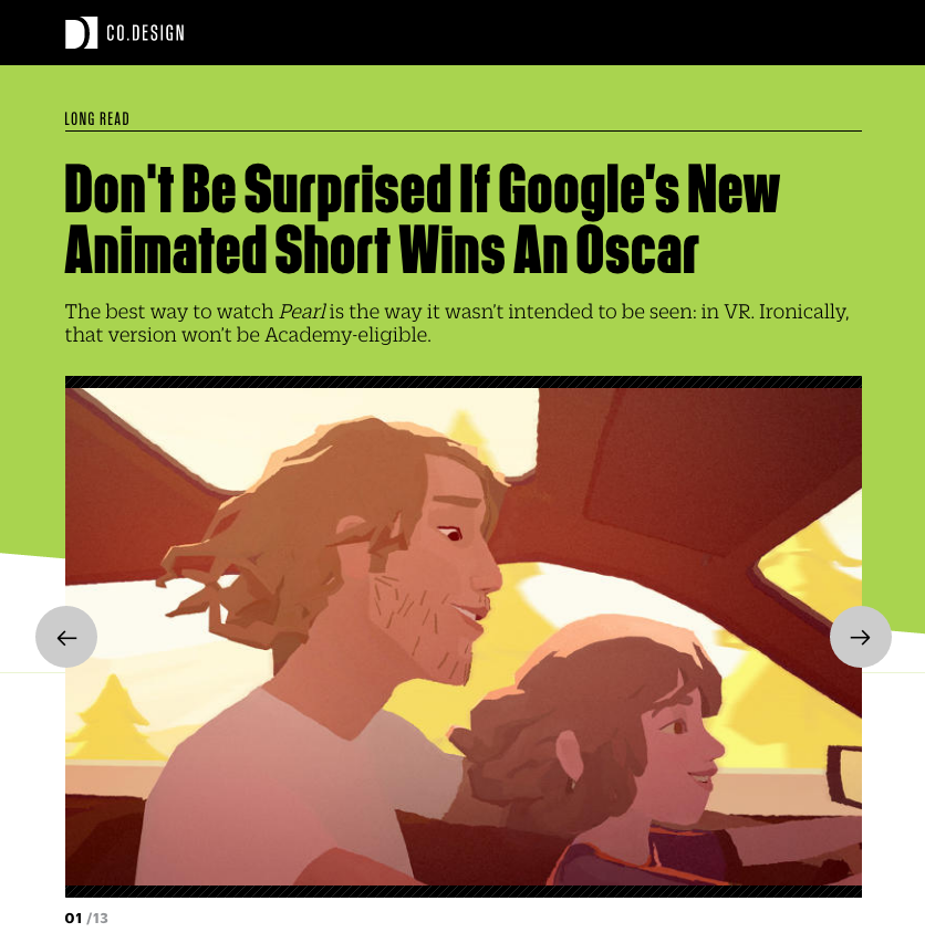
Fast Company Design, May 27: Don’t Be Surprised If Google’s New Animated Short Wins an Oscar
Beyond the Cartoons, May 22: Patrick Osborne’s ‘Pearl’ Launched at Google I/O Conference