Today we found this hummingbird dead on our deck. The poor beautiful thing! We never figured out what did it in, but I took a few pictures.
A timelapse map of the world
Okay, here’s something that hits all the right buttons: a timelapse map of the world made using webcams from everywhere on the planet. I could do without the elevator music in the background, but the video itself is just fascinating! Eureka moment: seeing the wave of daylight spread from east to west across the whole globe.
Related to this: the Google search activity map. (Both links via infosthetics.)
Animation Mentor!
This week I start my first term mentoring students for Animation Mentor. I’ve spent a few days browsing around the site, checking out the work of the students and the critiques of the other mentors, and I am deeply impressed. It’s so well organized, and so much thought has gone into everything, and there’s such a great sense of community among the students and mentors! These guys have really put together something special and new, and I hope it’s a big success for everyone involved.
So, I’m really looking forward to this experience, and I expect to learn as much from the process as the students will. (As a friend of mine put it: a teacher who’s not always learning is not a very good teacher!)
Madagascar DVD comes out today
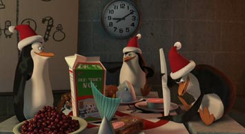
The Madagascar DVD comes out today. Finally, a chance to geek out and frame-by-frame your way through some of that crazy, snappy animation! They also added the Penguins Christmas Caper short that opened for the Wallace and Gromit movie last month. I’m so glad to have been part of these projects. Both the movie and the short were stupendous fun to work on.
Animated News has a sneak preview of some of the features, including a still frame of one of my shots! Check it out:
a morality play in one act
Unnatural love between a man and a truck can only lead to danger.
Criticizing the critics.
This is the first time I’ve worked on a movie that I felt a real emotional attachment to, for better or worse. I loved working on Madagascar, loved the people I worked with, loved the characters, the look, the animation style, and the story premise. The movie speaks to me as a New Yorker and as a warm-blooded mammal. It’s freakin’ hilarious. And the humor is deeper and more character-driven than any of the others I’ve worked on, and I love that.
So I was pretty much completely shocked to see that there are many critics out there who didn’t love this movie like I did. (My friend Melanie felt the same way.) Was I just too close to it? Does the movie have some gigantic deformity that I just couldn’t see? A face that only a mother could love?
The answer is no. After seeing the movie a few times with real audiences, and taking some time to reflect on all the reviews, I’ve come to the conclusion that most of the movie’s worst critics are simply being unfair. Many of them make valid points about problems with the story’s pacing, plot, theme, and so forth. But the conclusions they jump to are completely at odds with everything I know about the experience of enjoying a movie.
Critics of Madagascar seem to fall into three categories: DreamWorks-haters, genre bigots, and the genuinely thoughtful.
The DreamWorks-haters are characterized by the intellectually weak argument that if it ain’t Pixar, it’s crap. These people tend to be more interested in the politics of company A versus company B, and often gloss over the actual films themselves in favor of cheap shots at the corporations that make them. They mistake the messenger for the message. The more sharp-tongued among them can still craft sentences that sting, but the sting wears off once you realize the depth of their ignorance.
The genre bigots are a more subtle bunch. They say things like “The classic shape of a children
Topological Tattoo
That Banksy
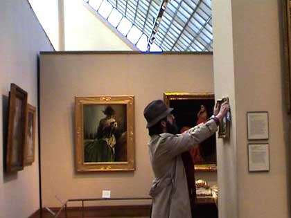
Banksy, that master of disguise, hits all of NYC’s major museums! In this photo he looks suspiciously like Inspector Clouseau. (via Wooster Collective.)

