Pluot’s interior structure, according to preliminary observations
Following on last night’s breathtaking new full-color photo, we have even more exciting news to report. Pluot is finally revealing its secrets to scientific observation! Here is an artist’s rendition of what we know so far about its internal structure.
As New Horizons’ science mission reaches its suspenseful climax, researchers in Northern California are busy analyzing a flood of new data about this mysterious object. Approaching closer than ever before, we can see its dimpled contours and subtly mottled colors in unprecedented detail (click for the full resolution photo). Better yet, we have detected our first traces of the nearly spherical body’s atmosphere: a mix of tangy volatile aromatics emanating hundreds of micrometers from its surface. What an amazing day for science. Our team can’t wait to ingest all this new data!
We just saw Pete Docter’s brilliant and sweet Inside Out, which I highly recommend to anyone with a functioning heart and brain. As a sometime student of human emotion, and a fan of Paul Ekman’s work, I was impressed with how well tuned the five main characters were to the real mechanics of emotions. There wasn’t a moment in that film that didn’t ring true. If you haven’t seen it yet, go already!
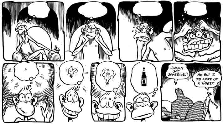
For those who liked the “who’s driving this thing?” angle of the movie, I want to point out another body of work that I’ve admired for years: Tim Eagan’s Subconscious Comics, which ran in a Santa Cruz newspaper from 1981-2000, and appeared in book form as The Collected Subconscious. It’s a more adult and irreverent take on the same subject, where instead of the five cardinal emotions at the controls, it’s a hairless chimpanzee in tighty-whities known only as “The Boss”, surrounded by an entourage of anthropomorphized neuroses. Definitely not for kids, but lots of fun for grown-ups. Enjoy!
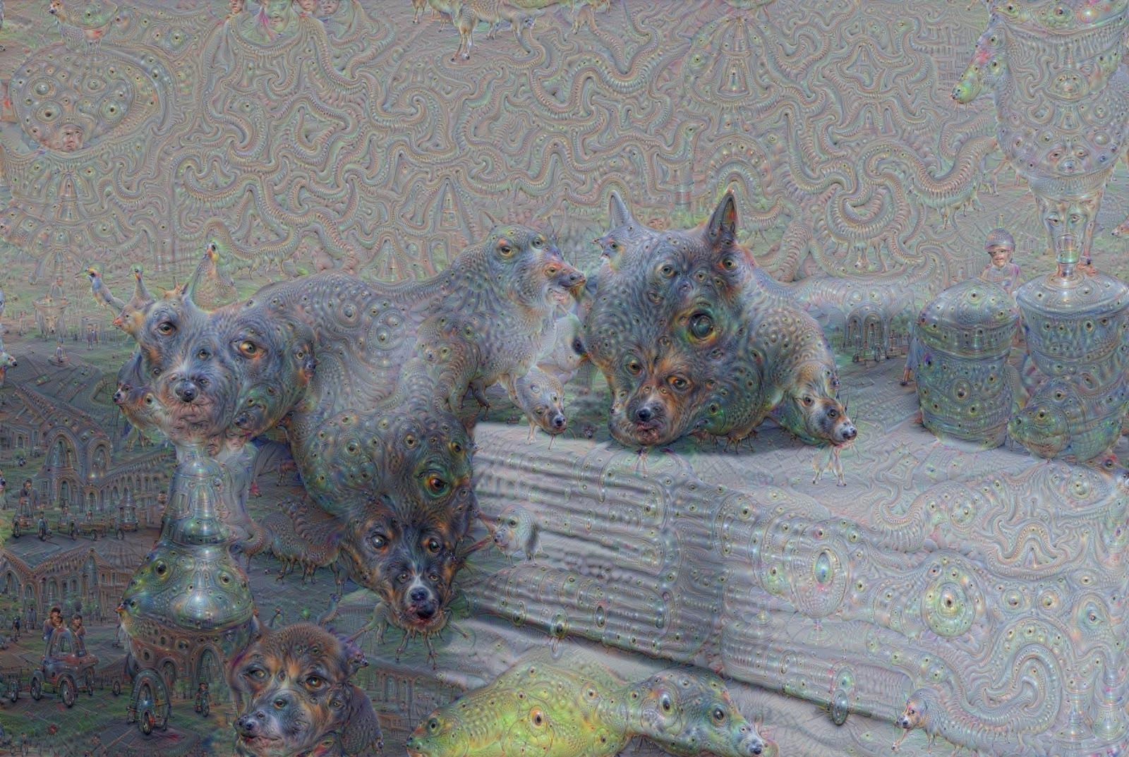
A few days ago the image above started going around the social networks, attributed to “a friend working on AI”. Apparently a deliberate leak, now we know where it came from: a research group at Google working on neural networks for image recognition. Their research is worth reading about, and the images are fascinating: Inceptionism.
I have to admit, machine learning makes me jealous. Why does the machine get to do the learning? Why can’t I do the learning? But projects like this make me feel a little better. When the black box opens and we see the writhing mass inside, we get to learn how the machine does the learning. Everyone wins.
And the machines still have some catching up to do. As soon as I saw the amazing gallery of inceptionist images, I recognized the “inceptionist style” from the mysterious grey squirrel. Could a neural network do that?
Here’s something different: I have a new job! Today was my first day at Google Spotlight Stories. I’ll be working with some amazing filmmakers and technologists who are busy inventing a new kind of narrative visual storytelling uniquely suited to handheld mobile devices. If that sounds crazy, that’s because it is. It’s my kind of crazy. It’s exactly the kind of wild, inventive, “let’s try this and see what happens” attitude that got me interested in computer graphics in the first place, all those years ago. I couldn’t be more excited.
The video above really does a great job of capturing the delight of experiencing one of these stories for the first time. It’s almost impossible not to grin like a ninny. There’s not much more I can say about it right now, but there’s been some terrificpress about the projects they’ve created so far. I’ll share more when I can!
A more perceptually-uniform, though arguably less pretty, pseudocolor scheme.
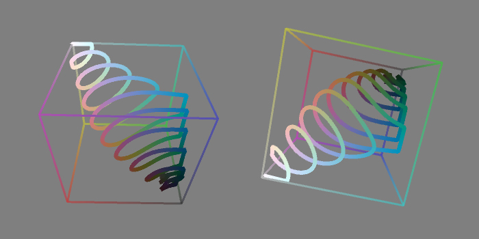
Inspired by this brilliant interactive demo of the perceptually uniform CIE L*a*b* color space, I decided to try a L*a*b* version of my pseudocolor scheme. I don’t find this version as pretty to look at, but it has the advantage that higher values are always mapped to colors that are perceptually brighter than lower values. In other words, if you squint at the image above, the bright and dark regions correspond pretty much exactly to what you’d see if it were greyscale. (For the L*a*b* to RGB conversion, I grabbed pseudocode from this handy page.)
L*a*b* space is much bigger than RGB space, so the spiral gets clipped by the sides of the cube in a few places.If you crank up the saturation, you do get more vivid colors, at the cost of a lot more clipping.
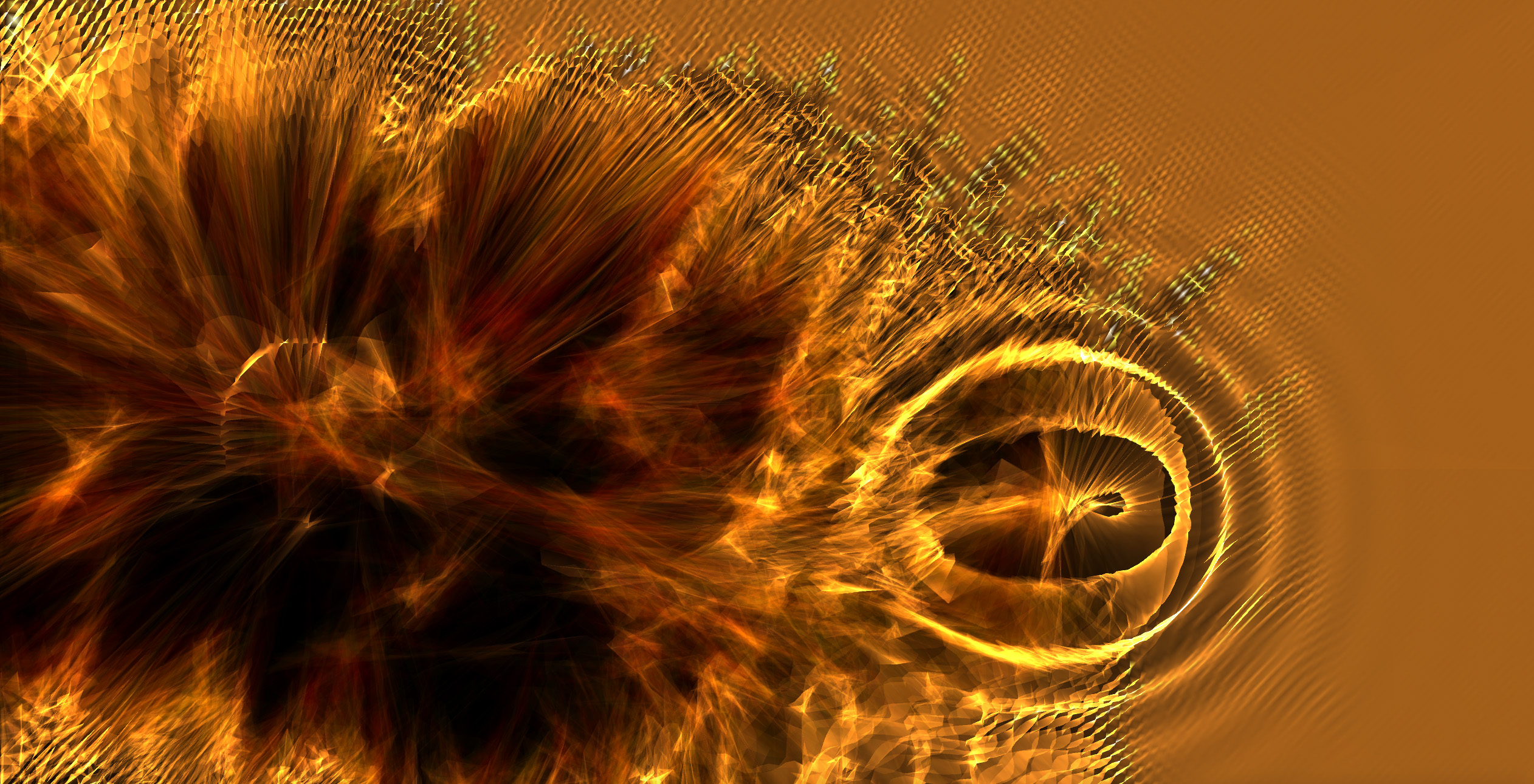
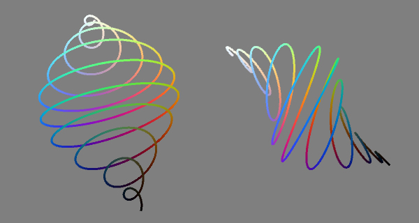
A shader experiment gone horribly, beautifully wrong.
I was tinkering with some GLSL shaders in Processing, and I needed a way to visualize a value that smoothly changes from 0 to 1, showing a lot more than the 256 levels of gray that you’d normally see. So I wrote a little pseudocolor function that spirals through colorspace from black to white, hitting various hues along the way. It’s fun, and pretty, and very rungy-chungy, so I thought I’d post it here.
vec4 pseudo3(float val) {float reps = 20.0; float pi = 3.14159256; float bright = val; float con = 0.25 – 0.20 * cos(val * pi * 2.0); float sat = 0.66 – 0.25 * cos(val * pi * 2.0);
Here’s a rough cut of part of a short film I started while working at the University of Washington. I did all the animation, and developed the Loose and Sketchy rendering style.
The character animation is pretty janky overall, though a few of the shots hold up pretty well. I sure have learned a lot since 1998!
In the 1990’s, it was typical for production companies to start their demo reels with a clock-wipe countdown. Some companies would use this as an opportunity to say something about their style, and do custom animation. (Will Vinton Studios, I remember, had a particularly cool stop-motion countdown at that time.) I thought it would be cool for Xaos to have a countdown that reflected our particular style of work, so I created this drippy ink effect counting down from 10 to 1, and a drippy version of the Xaos logo, which we put at the beginning and end of our demo reel respectively.
Some time after this, our producer got a call from MTV. They had this show called “Top 20 Video Countdown”. They wanted to use this effect for the bumpers and interstitials. Could we add the numbers 11 through 20? Our producer said “of course”, and charged them a lot of money. But it didn’t really take me that long.
Cassidy Curtis's splendid display of colorful things.